

02 Behind the Graphic: Welcome to the Borough of Basketball
Lets Slay Dragons on 7th Avenue


The Idea
I was on a train platform at approximately 9:00 pm in Flushing, New York when I got the text from one of my close fellow Knick fan friends. In disbelief the only right thing to do is to check his claim with Woj’s twitter feed while crossing my fingers in hopes he didn’t read something from @wobespn instead.
He in fact, did not, and Mikal Bridges is, in fact, a New York Knick. My excitement for when these things— big trades or free agency signings— happen usually geets expressed by me making some sort of art as tribute to it. If you go on my Instagram (quick plug for @643studio) you will find years of my work of making designs as soon as players like Fransisco Lindor or Garrett Wilson came to New York.
Mikal to NYK was always a dream, one that seemed to have little of hope of reality due to his status with the Nets and their point in the rebuild process. But against the odds, he will take the subway uptown to meet his fellow Villanova teammates Jalen Brunson, Josh Hart and Donte DiVincenzo in hopes of reproducing the magic they were able to capture twice at Villanova.
The reuniting of the NOVA 4, alongside Leon Roses ability to trade for Mikal and keep the rest of the team intact (with resigning OG Anunoby) meant I was only left to do one thing. Honor them with some quality time in Photoshop.
The Inspiration
I was heavily inspired by one of my past designs for this one and building on the idea of warm light, good player treatment and geometric assets in the background. I also was very aware of attention to detail on this design and adding small text and assets to tie the whole piece together. Small details are really what I think elevates good design to great design.
Some pieces that I got ideas from for this.


The Process
Original idea I had was to build off a big photo of Mikals head with close cropped images and gradient maps. Once I found the big photo I took a different direction from there and hoaned more on a player treatment focused graphic.
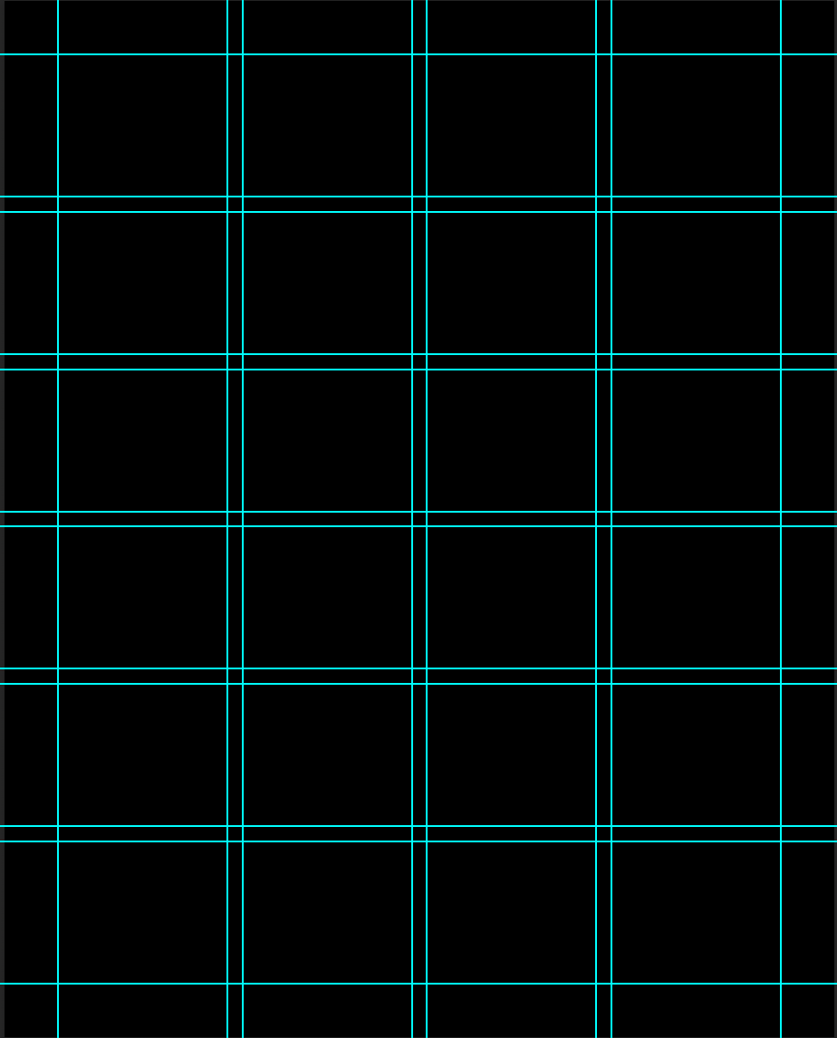
I once again worked off a grid for this piece and I confirmed by transition to the dark side. I am never gridless designing again. Layout just flows easier with it (even thought it still takes me 4 hours)…
From there the other pieces flowed, text, the secondary images and the shape assets. I didn’t even do a final color correction on these piece because once I finished with assets I was really happy with the overall look.
Player Treatment
I focused on treatment first. Here is a time lapse video of the process.
My biggest tip / secret (???) for bringing out detail in players in LOWERING CONTRAST AND BRIGHTENING SHADOWS. OMG. You can see it in the process here but it gives you a flat image to work with (almost like Rec.709 footage if you have worked with video) and from there I build on adding depth through white, highlights, blacks and curves. Something about this works for me.
A good tip that I don’t know if others do is COLOR GRADE your photos when you are doing your other Camera Raw adjustments. This makes your image look professional and is a really good place to start with what color direction you may want to use for the rest of the piece.
For a lot of this design I was going based off my work with my Coco piece, where as soon as I graded the main image I had just a hint of green in the highlights and that led to me wanting bring that into the final piece.
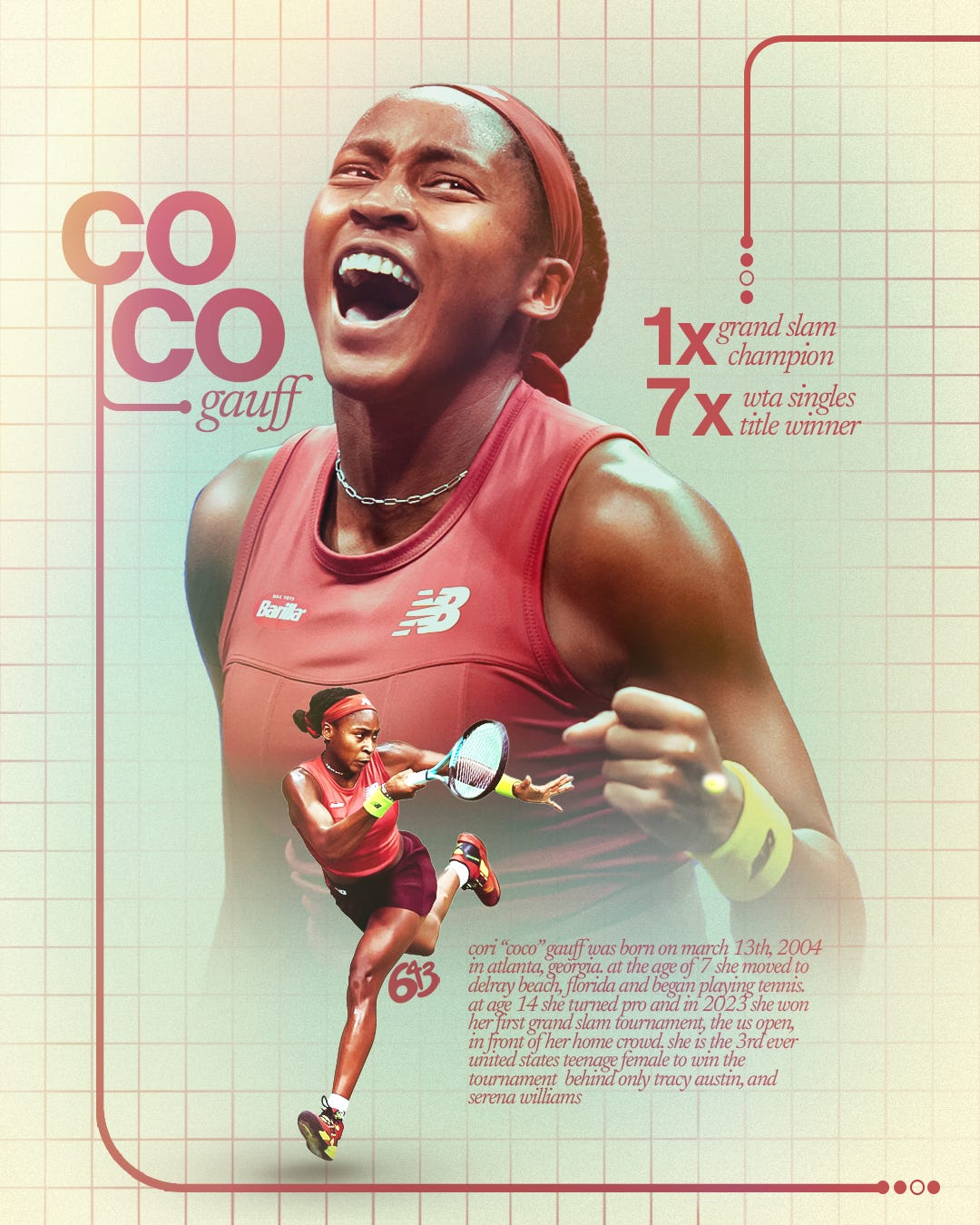
With Mikal, I wanted to emphasize warm tones with yellow and orange highlights. Orange was important because it is a uniquely Knicks color and not something that Brooklyn uses. For a while this design looked like a Nets design and I was not jiving with that for obvious reasons. I even ended up changing the jersey to just be white and gray as well.
The specifics of my (current) treatment process are as follows. Camera Raw (which is really 80% of the work), dodge and burn, highlights (using curves and masks) and shadows (curves and masks).
To me, mastering player treatment is mastering Camera Raw. To master Camera Raw you just have to edit photos. This is a great excuse to take photos and play with them in Lightroom :)
A visual step by step of the process:


Some people will do layers upon layers for player treatment. This is 6 layers including the jersey change. Good treatment does not have to be complicated, it all comes from good photo selection (image larger than 4 MP) and good use of Camera Raw.
The secondary images were edited with the same exact Camera Raw treatment with adjustments where needed. I only did dodge and burn on one of them.
They were topped with a curves layer that gave them that flat shadows effect.
Layout
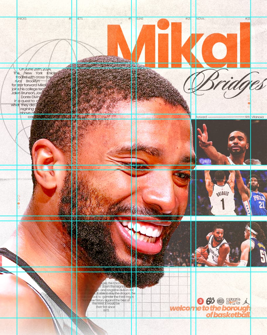
I worked on a 4 row by 6 column grid with a 20 ppx gutter and 70 ppx margins for this project. this is a visual representation of the grid.
She is lovely and I enjoyed working with her.
In my head is where all designs are born and originally for this one I envisioned a big face dominant photo of Mikal on the left hand side, so thats what I started with. From there I added type and the secondary images which were aligned using the grid.
My biggest layout struggle points were the top left and middle right. After scrolling through Pinterest and seeing the Royals design I settled on adding a globe / basketball vector to the top with some type overlayed. The middle right I settled on the grid (stolen from my Coco design) and more type in a circleish shape.
Most of the elements are within the grid, but the “Bridges” type, the secondary photos, and a few other small things are not. I got inspiration to do the type placement for the top margin text from the Cowboys design above.
Overall I am happy with the balance of the piece. I was struggling with it being too busy but I think I landed on a sweet middle spot with all of the elements.
Type
Originally I had my unstoppable duo of Newsreader/Helvetica Now, but as I worked through the design I realized I didn’t want a script and serif font in the same piece so Newsreader took a back seat for this one.
I opted for classic Adobe San Serif Font “Poppins”, in bold for the big text, extra bold italic for the bottom text and light for the smaller text. The script typeface is Adobe font “Sloop”.
Details / Elements
Some of the final details I wanted to talk about are the smaller elements on this design.
The set of 4 logos was inspired by the USC design above and their use of icons. I knew I wanted a Knicks logo in there but the main logo didn’t fit the shape I wanted so I opted for the alternate. I also wanted to use a Nike logo and remembered the Knicks City Editions have the Nike NYC logo embroidered onto it instead of the regular swoosh. They also use the jumpman on their statement editions so I used that as well.
Lastly, I added by 643 logo and the icon for the 3 train, which is one of the subways that takes you from Brooklyn to midtown Manhattan.
Final Thoughts
Overall I am happy with the final result of the piece. Any time I am able to achieve good, clean, player treatment I know the final design will at least look somewhat good.
Layout is something I am still continuing to grow and get better at. This one I am happy with, but I know I can do better as I continue to iterate my process from conception to completion.
Thank you so much for reading about my process and I look forward to seeing you in the next one :))) !!
Graphic Photo Credits:
Big Mikal: David L. Nemec
Solo Mikal: Jessie Alcheh
Mikal Embiid Post-up: Unknown
Mikal Gordan: Unknown
I'm definitely going to have to start using a grid
Nice! An excellent demonstration and reminder of how useful a grid can be even in illustrated work.