


The Minted Project Part 1: Posters & Marketing
All About my Minted New York Concept Designs


Part II of the Minted Project will be posted next week! I broke up this article because Substack told me it was too long for email :( I also wanted to make sure all the designs got the attention they deserved :) I was able to reach the Minted team about my work on Twitter, and I am looking forward to hearing their feedback. You can follow their journey running a small business in NYC here: The Minted Minutes,
You can find the full Minted project on my Behance here if you are impatient for pt2 :))
How it Started
After chatting with one of the lovely graphic designers at the Mets during my time as an intern there this season, he suggested that I add a brand case study to my portfolio to show that I can exhibit executing designs with a preexisting company creative vision.
I also wanted expand my portfolio and show that I was more than just a poster designer, but also a logo, apparel and brand designer, which are areas I am also truly passionate about.
Several months later with ideas burning holes in my pockets and a need to fill, the Minted (
, ) project was born, and here is how it all went down.Minted since its first inception on Tik Tok in 2021 had greatly expanded to this brand from just jewelry. It was lifestyle, fashion and confidence, but it was also running and health and well being. The ability of the company to have such a clear vision with so many objectives led to a plethora of concepts for me because there were endless amounts of directions I could go in.
Sometimes the ideas just come so easily. Something about the way the brand shapes itself gave me an endless flow of ideas.
It is also such a great name and great names just make it so much easier.
There was already a lot of great existing material that Minted had put out that I felt some pressure to make stuff that I think would improve their current offerings, but I think I rose to the challenge to make some strong additions.
I broke up my project into 2 sections, marketing & poster designs and logos, apparel & accessories designs.
Lets take a look at the process.
1.) Marketing & Poster Designs
Minted x Saucony II Poster
My graphic design portfolio up to this point had mostly focused around poster and marketing design, that is what I started with for this project since I knew it could get my juices flowing in Photoshop.
Minted is releasing their second shoe with running brand Saucony in the fall and I wanted to make an ad inspired by the Nike and New Balance ads of the 80s (with a fresh twist) that would be fit for advertising their upcoming release.

I have mixed feelings on brands copying Nike, but I truly think that strong copywriting is the foundation to a good ad campaign and effective lasting brand impact and thus this ad was born.
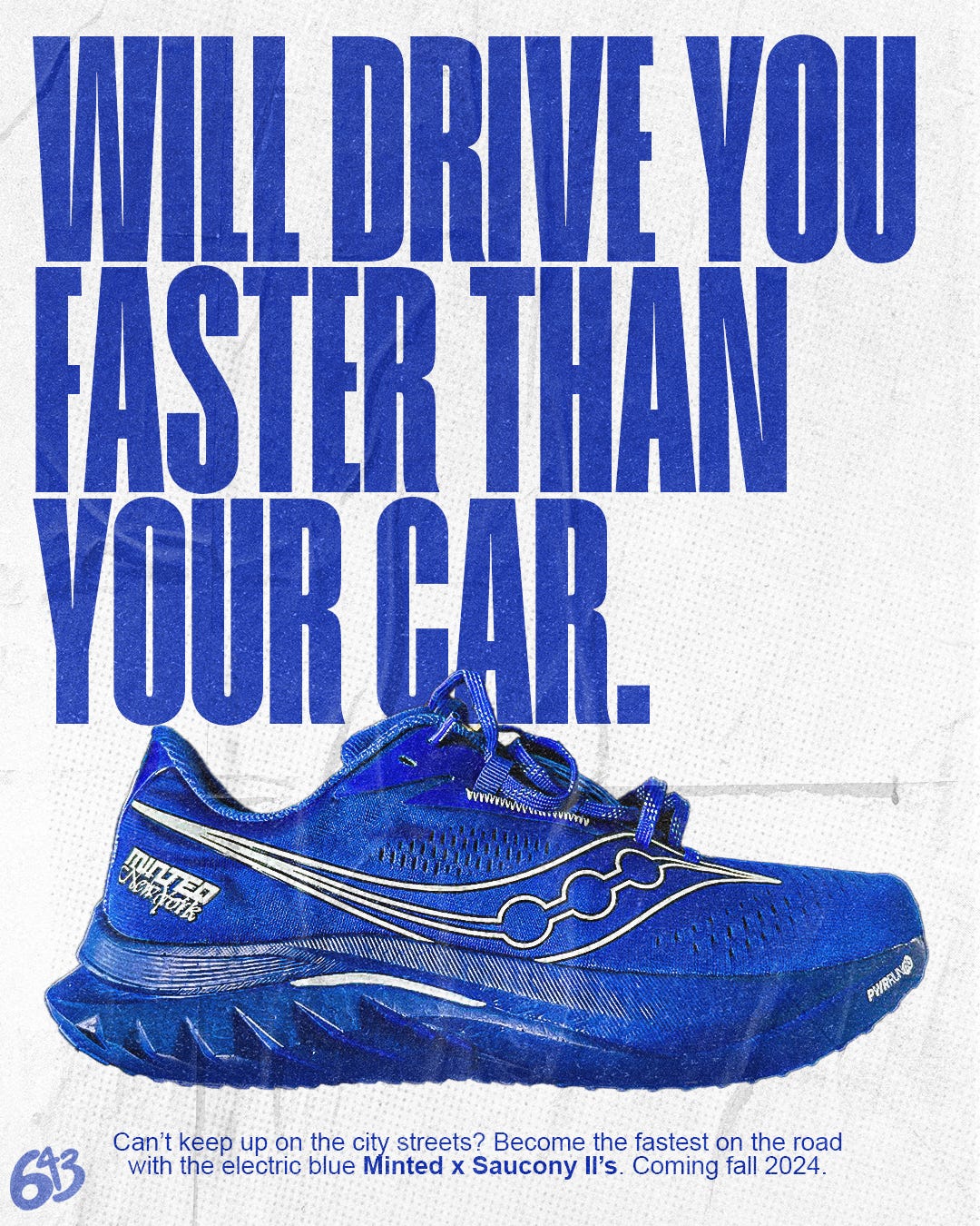
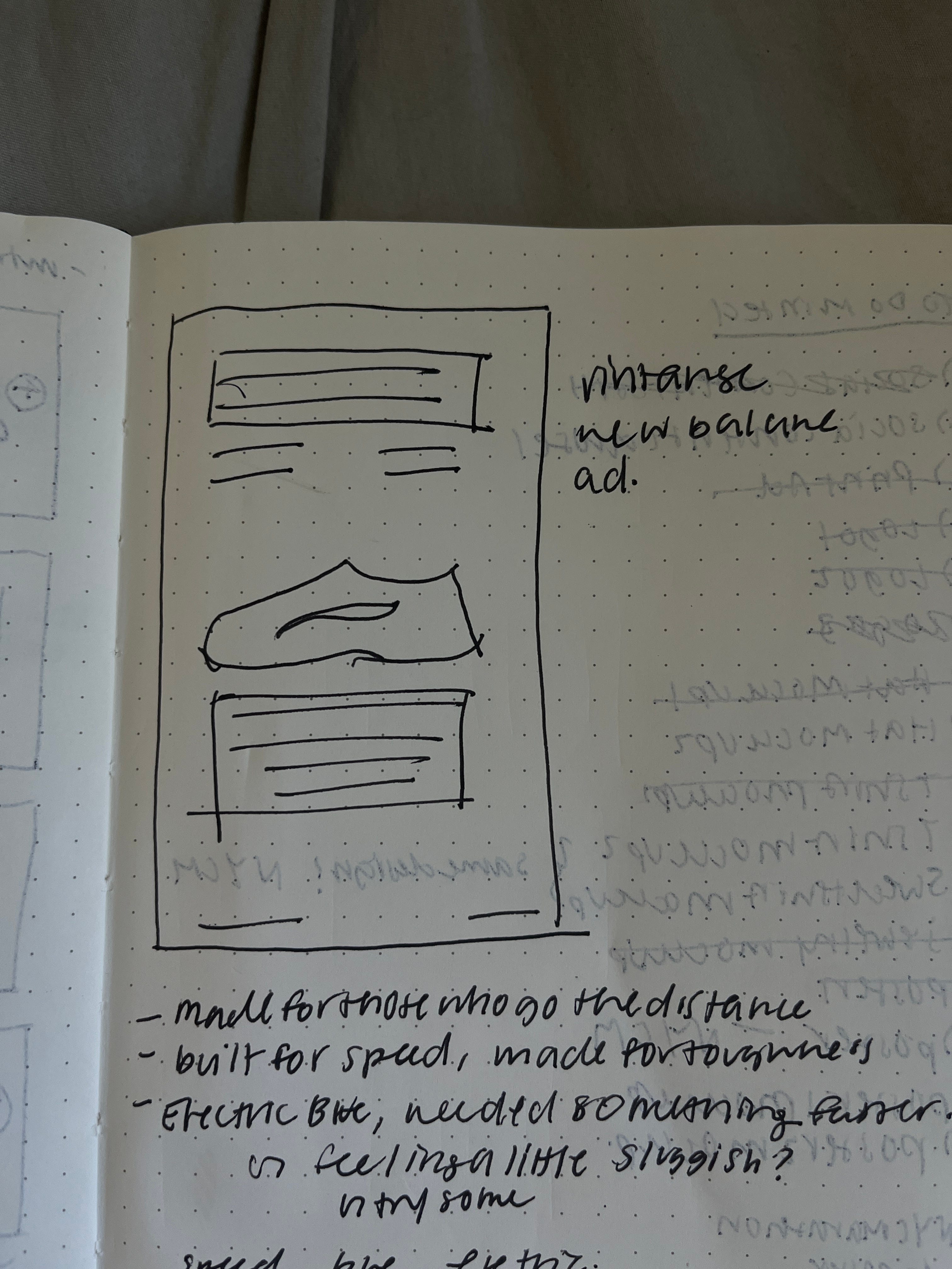
As you can see on the homepage of this Substack I am a fan of the color royal blue, and when I first saw these shoes I was simply fawning. A few weeks later when the Minted vlog was dropped talking about these shoes, a quote that stuck out to me from it was when they were discussing why they didn’t use the Minted green and it was simply because they “needed something faster”.
In my notes you can see I was trying to come up with copy that would embody the that, as well as the color, and this led me to “Will drive you faster than your car”.
I still am so happy with the copy on this. I think it embodies the idea that this shoe can make you feel faster just by wearing it, and will motivate you to run as quick as you humanly can.
I think this could be a really effective ad for social, but I think it would be even better if it was wheatpasted across the city because a.) that would be so cool (?!?!), b.) that would make great social content in an of itself and c.) wheatpasting is still and effective form of physical advertisign which is greatly underutilizee in out digital age.
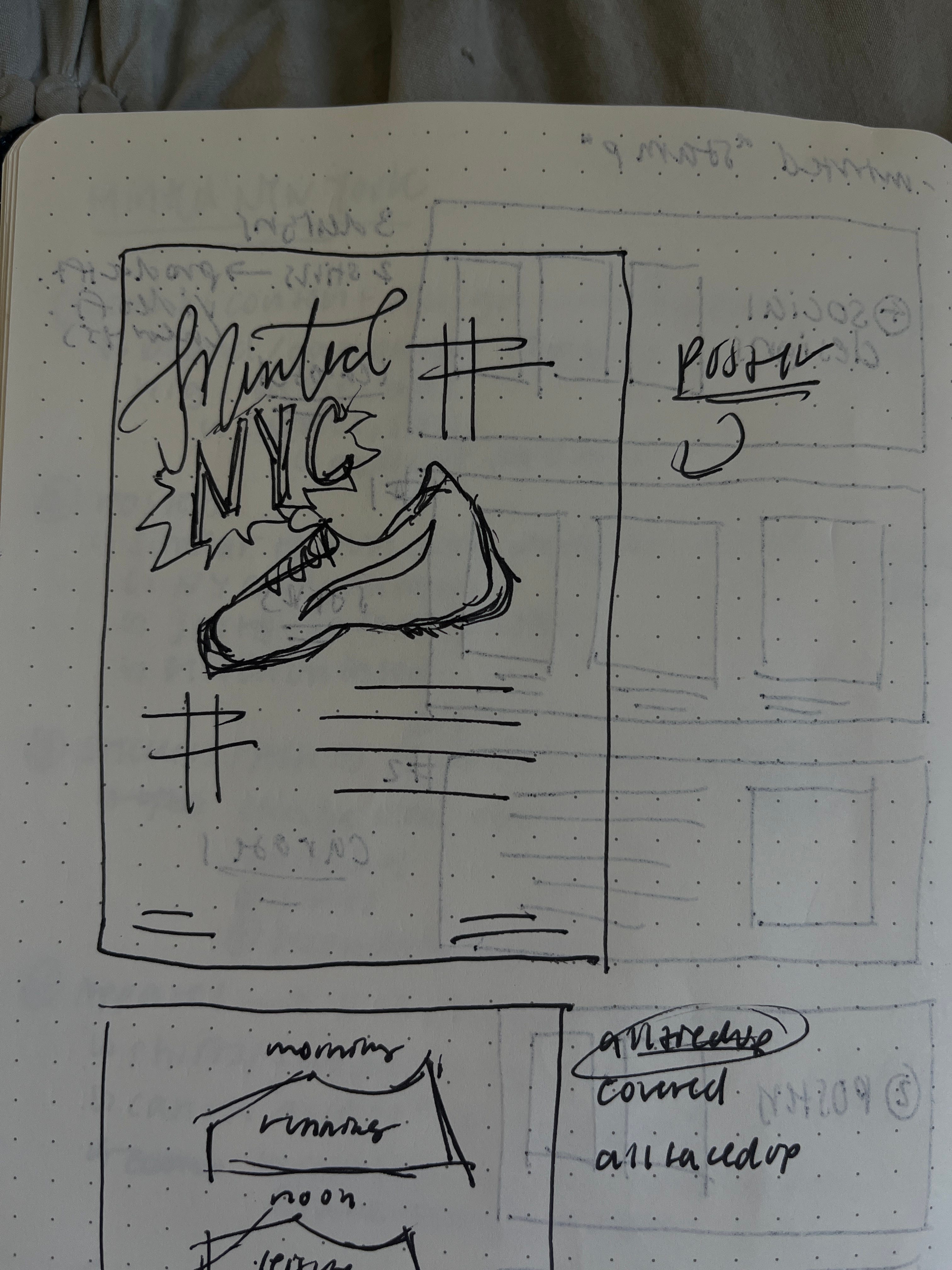
Here is a mockup I did of what a wheatpasting would look like:

I think it would look very cool, but I do think this would be effective across social as well.
Spearmint Poster
Sometimes you just get a vision in full completion, and that what happened with this one.
I had been inspired by one of my favorite artists, Walker TKL, and his Chicago-grocery style posters of NBA greats, and I wanted to create my own grocery-ad style poster for the Minted x Saucony I’s.

This shoe is no longer in production, but I think it helped transcend the brand, and thus can still be effective to use in marketing design. It is also so pretty and I wanted to use it as a model!
This was the original idea, I knew I wanted that pencil scratch style, so I hopped over to Procreate and created this in here. I touched it up in Photoshop with some sharpening after and this is what I came up with.

I love everything I made from this project but got this is so good. The color and the shading and the copy (????) I just love it so much. I think its so clever and fits perfectly into Minted athleisure style as a poster, but I also mocked it up on a sweatshirt and t-shirt seen here:


I could do a whole post on how I mocked up everything in Photoshop but that is a different story. I love how these turned out so much and I might just print a poster of it for myself LOL.
The Minted Magazine Carousel
The last concept I had for this section was a social carousel for Minted to post inspired by a magazine thread.

I liked the idea of adding another dimension of product promotion to their social accounts and this I thought was a great way to keep the simplicity of the Minted brand in a more interactive way.
You can find the full Minted project on my Behance here if you are impatient for pt2 :))
Part II of the Minted Project will be posted next week! I broke up this article because Substack told me it was too long for email :( I also wanted to make sure all the designs got the attention they deserved :) I was able to reach the Minted team about my work on Twitter, and I am looking forward to hearing their feedback. You can follow their journey running a small business in NYC here: The Minted Minutes,
I absolutely love the electric blue poster! I’m a sucker for old Nike ads, and I think you did an amazing job of paying homage to those whilst giving yours a modern (and personal) feel! Excited for part 2 🙌